重构百年企业新篇章
--森那美Sime Darby汽车集团总部办公空间
New work | To Rewrite a New Chapter of a Centennial Enterprise
--Space Design of Sime Darby Automotive Group Headquarter Office
项目位处深圳宝安毗邻高速公路与公园、商业街区的交汇处。作为马来西亚历史最悠久的跨国公司森那美集团(Sime Darby),业主更希望改变原有的办公环境于风格,给员工更舒适的办公空间,彻底改造后不仅让办公环境拥有一种亲切独特的感觉,还与日光充足的窗外景观形成平衡和谐的关系。
The project is located in Bao'an, Shenzhen, adjacent to the highways, parks and commercial areas. As the oldest multinational company from Malaysia, Sime Darby, the owner prefers to change the original office environment and style to provide employees with a more comfortable office space. The complete renovation not only gives the office environment a friendly and unique feeling, but also forms a balanced and harmonious relationship with the bright view outside the windows.
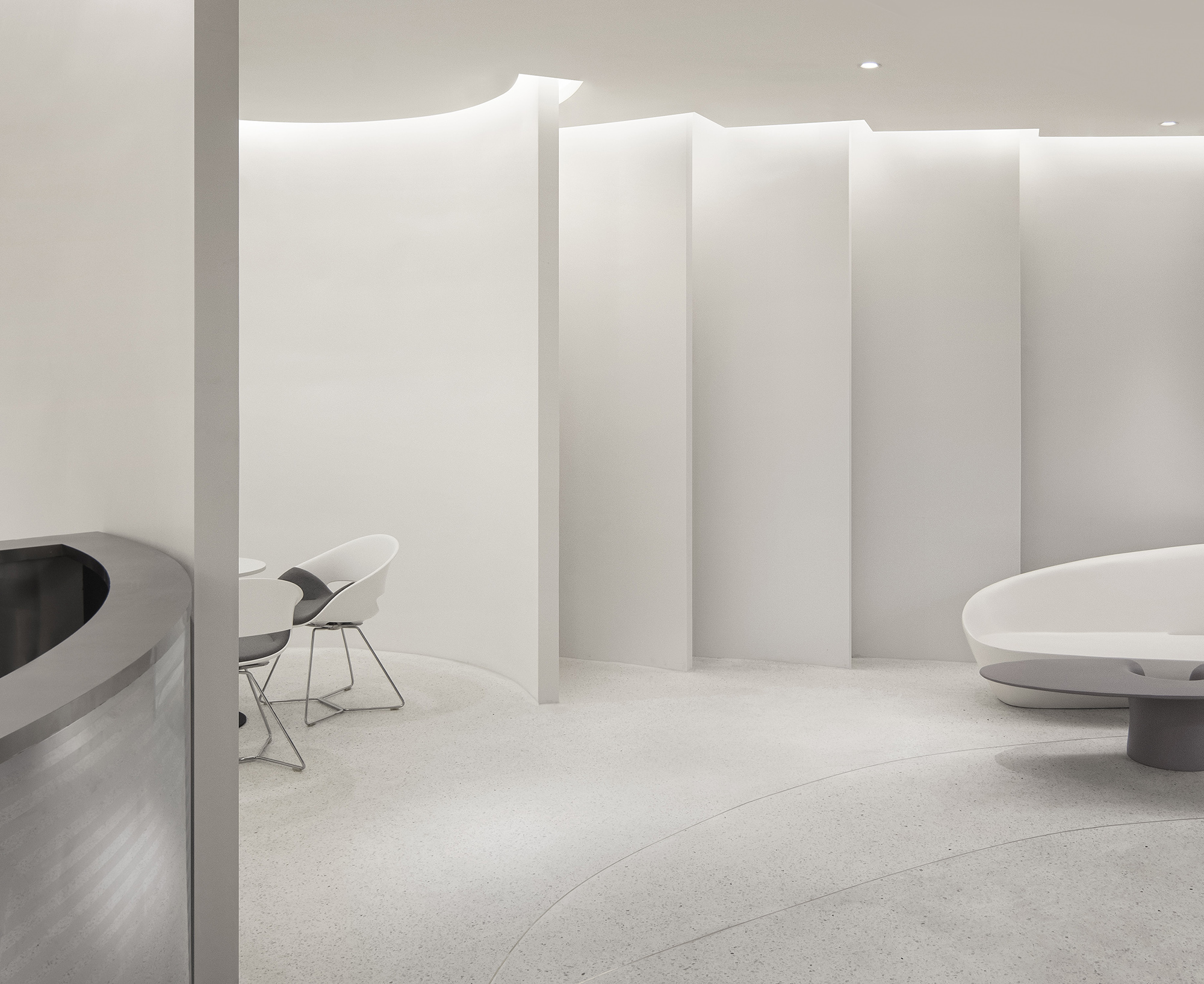
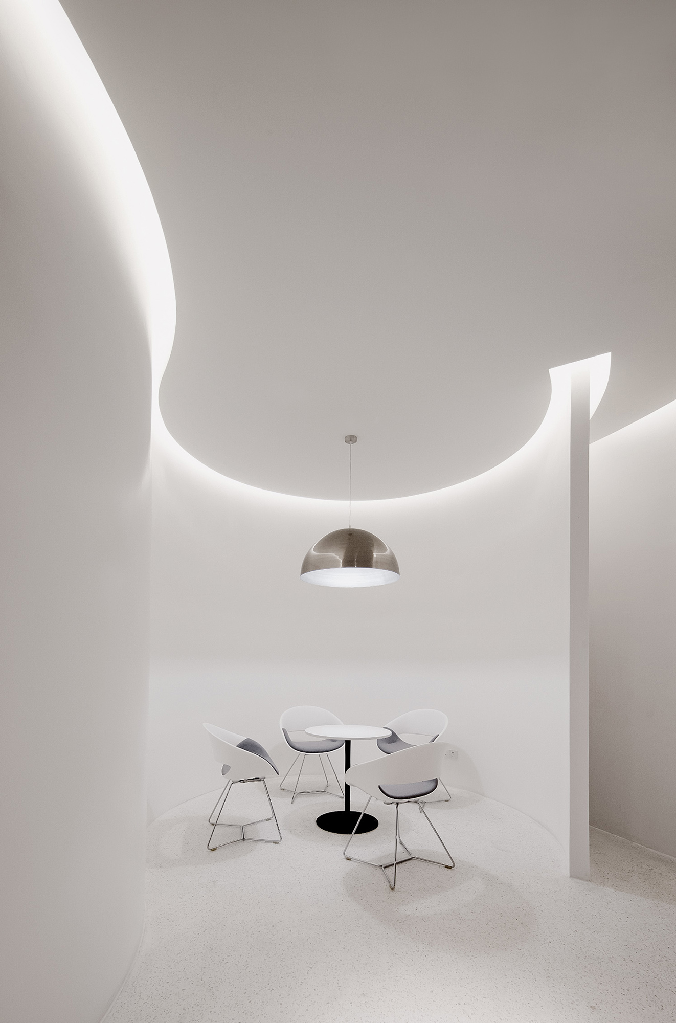
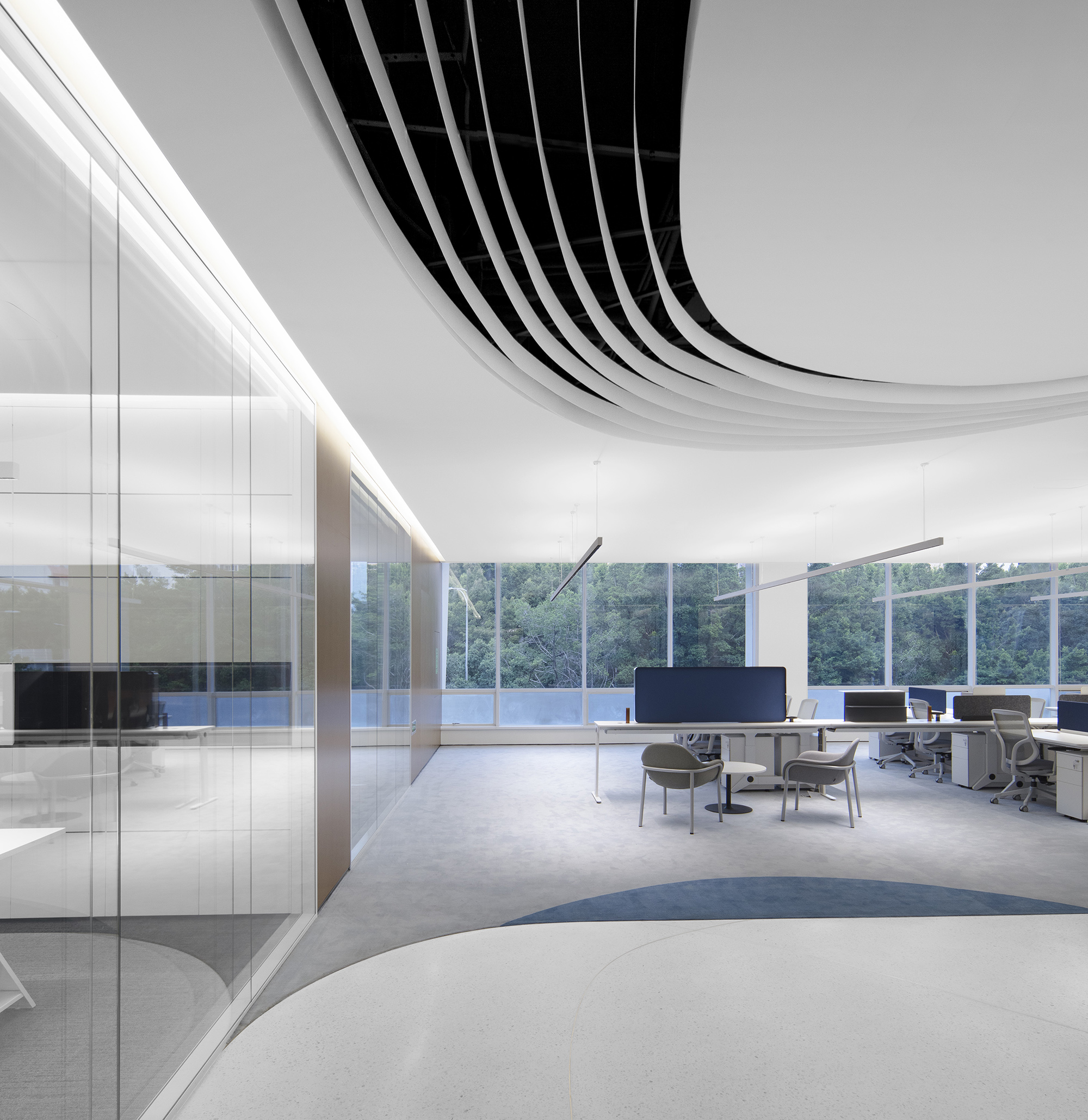
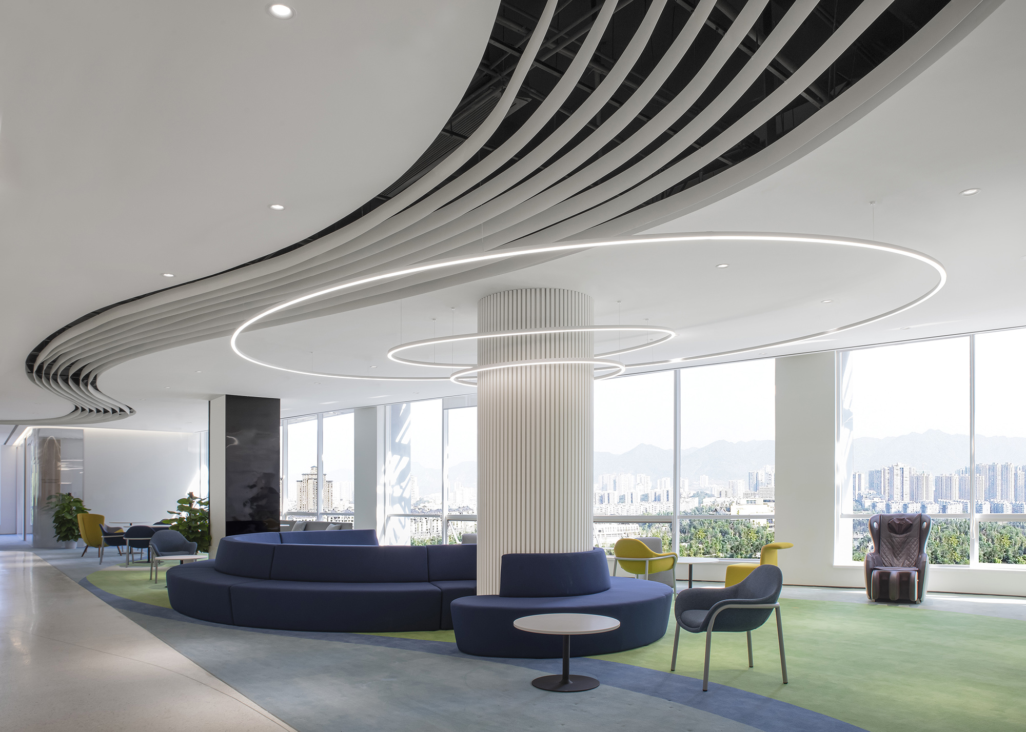
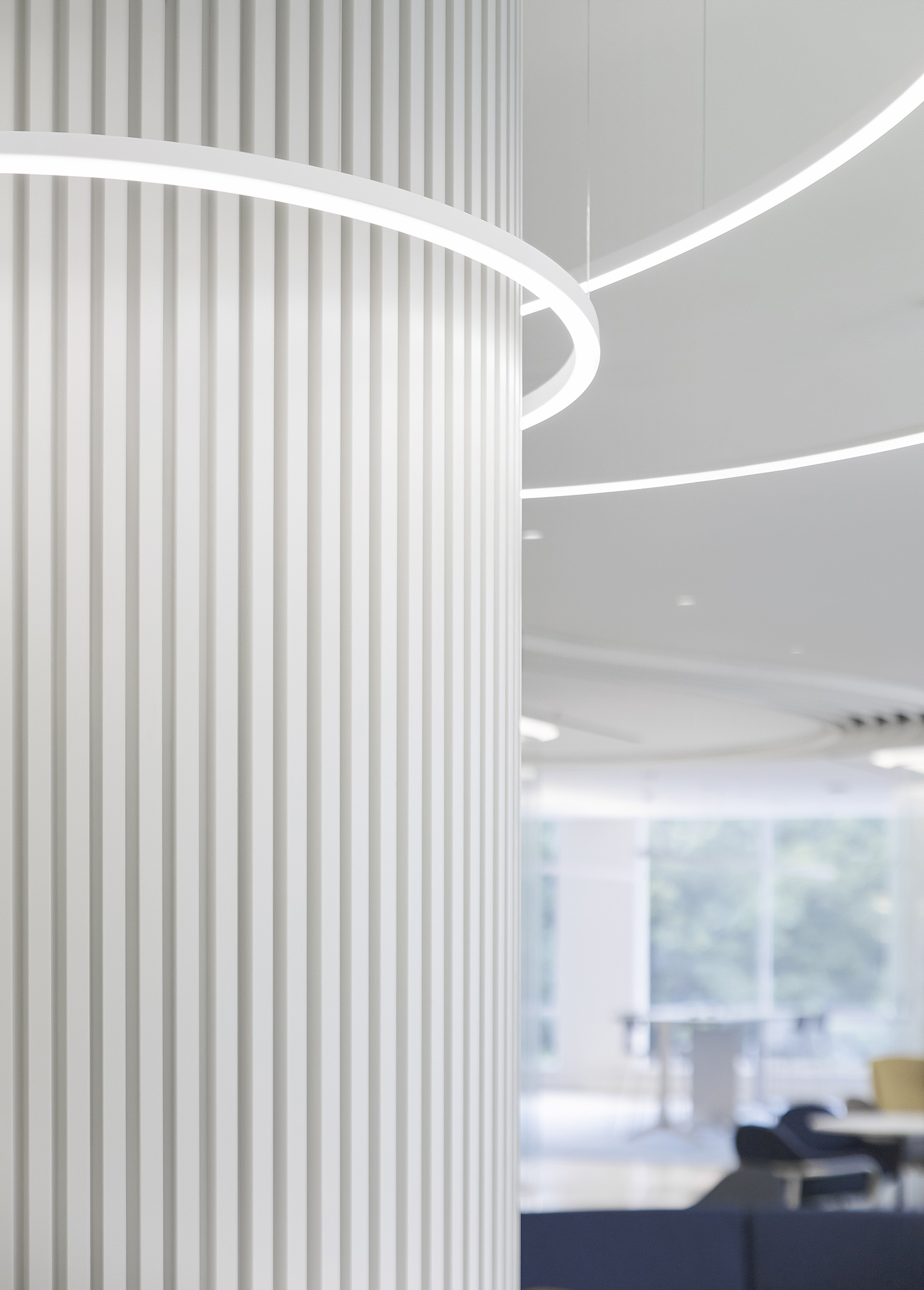
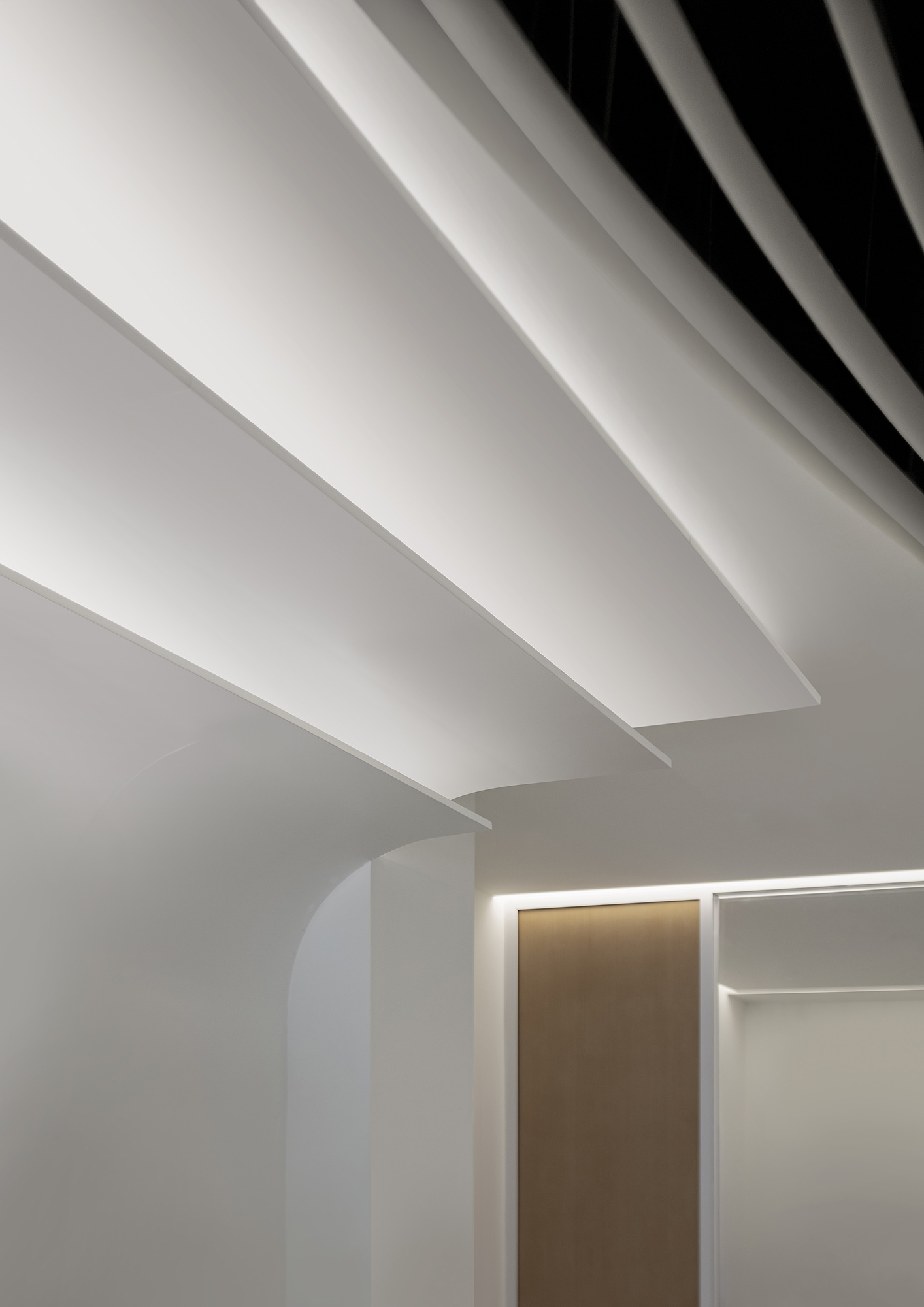
百年企业就像一本厚厚的典籍。设计概念以典籍为引线,从前台启始的页面造型开始,就像翻阅森那美这一百年的历史,顺着整条动线,天花似厚厚书页层叠的造型,也似不断涌动的海浪,象征了企业在持续发展中不断构筑美好前景脉络,构成富有动态秩序、便于协作沟通的办公氛围。
A centennial enterprise is like a thick classic. The design concept takes a classic as the lead. Starting from the pages modeling at the reception desk, the journey to look through the 100-year history of Sime Darby has begun. And along the whole moving line, the ceiling with the shape of thick stacked pages also resembles the continuous surging waves, which symbolizes that the enterprise will continuously build a bright future in its sustained development. The design constitutes an office atmosphere full of dynamic order and convenient for collaboration and communication.
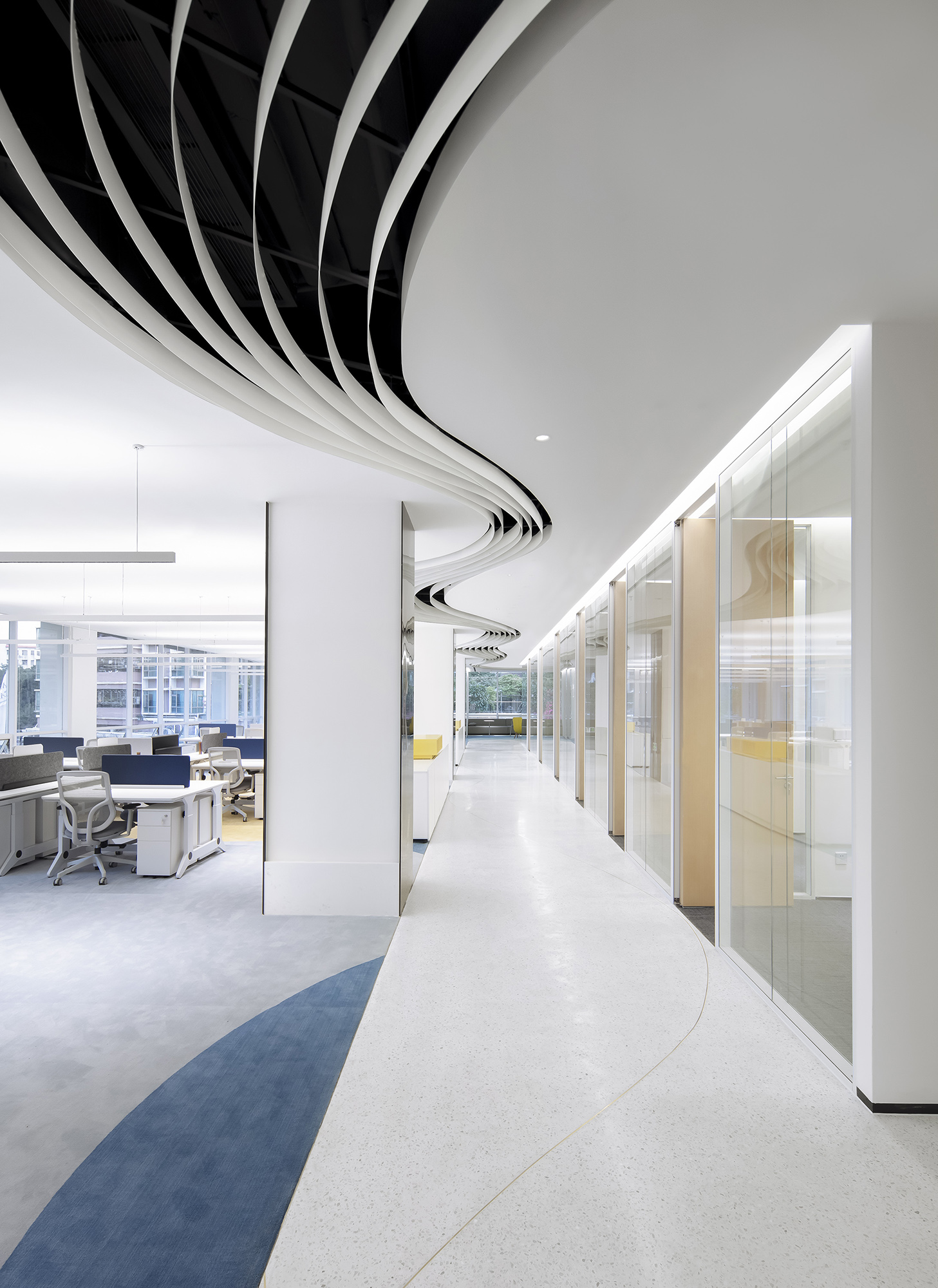
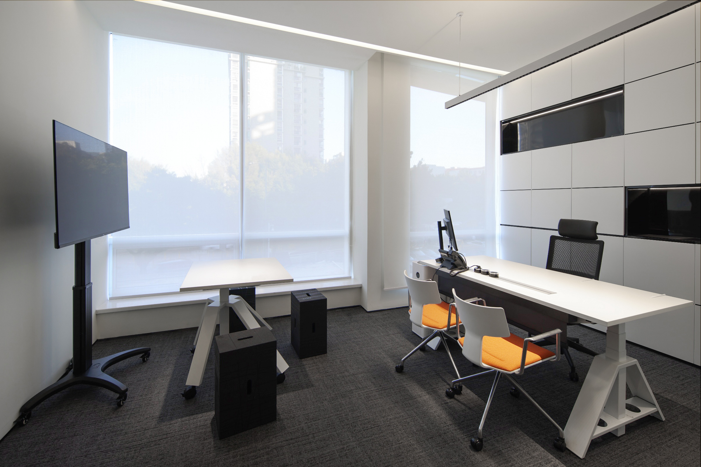
由扶梯入口开始,也在这里结束,中间围绕着常用的重要功能区域,像大小会议室、培训室、洽谈室、独立办公区等。人们顺着以动线为主体设计的走廊,可以非常轻松地到达办公室的任何一个区域。这种方式最大程度满足了场地的利用率,减少人们不必要的时间消耗,提升人与人之间的沟通效率。
It starts and ends at the escalator entrance, surrounded by common important function areas, such as large and small meeting rooms, training rooms, negotiation rooms, independent office areas, etc. Along the corridor designed with the moving line as the main body, people can easily reach any area in the office, which maximizes the utilization of the site, reduces unnecessary time-wasting and improves the communication efficiency between each other.
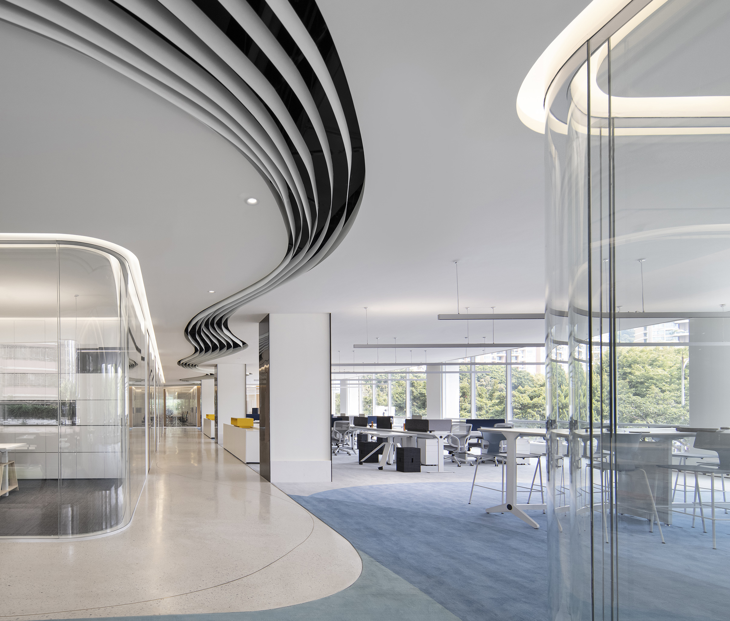
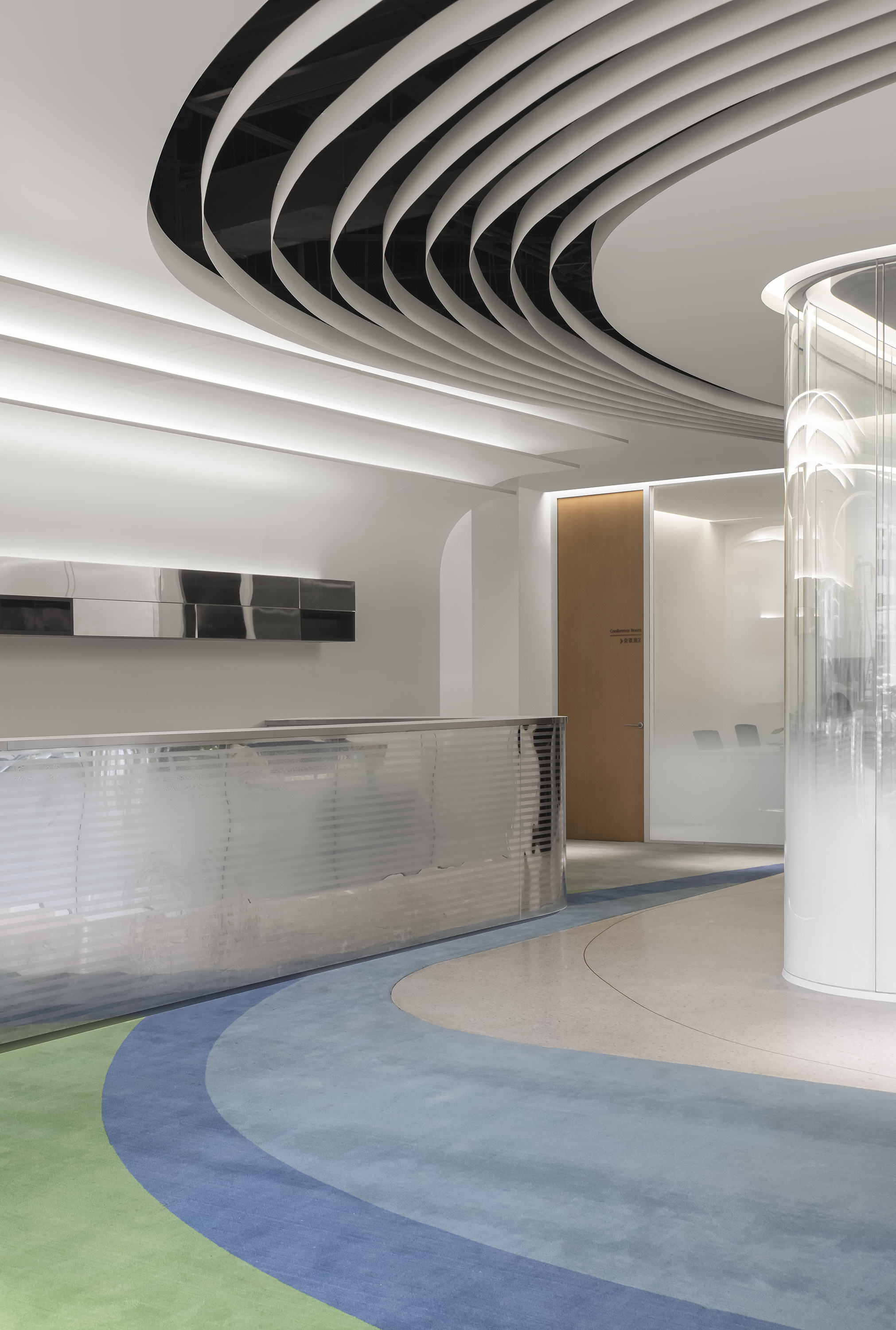
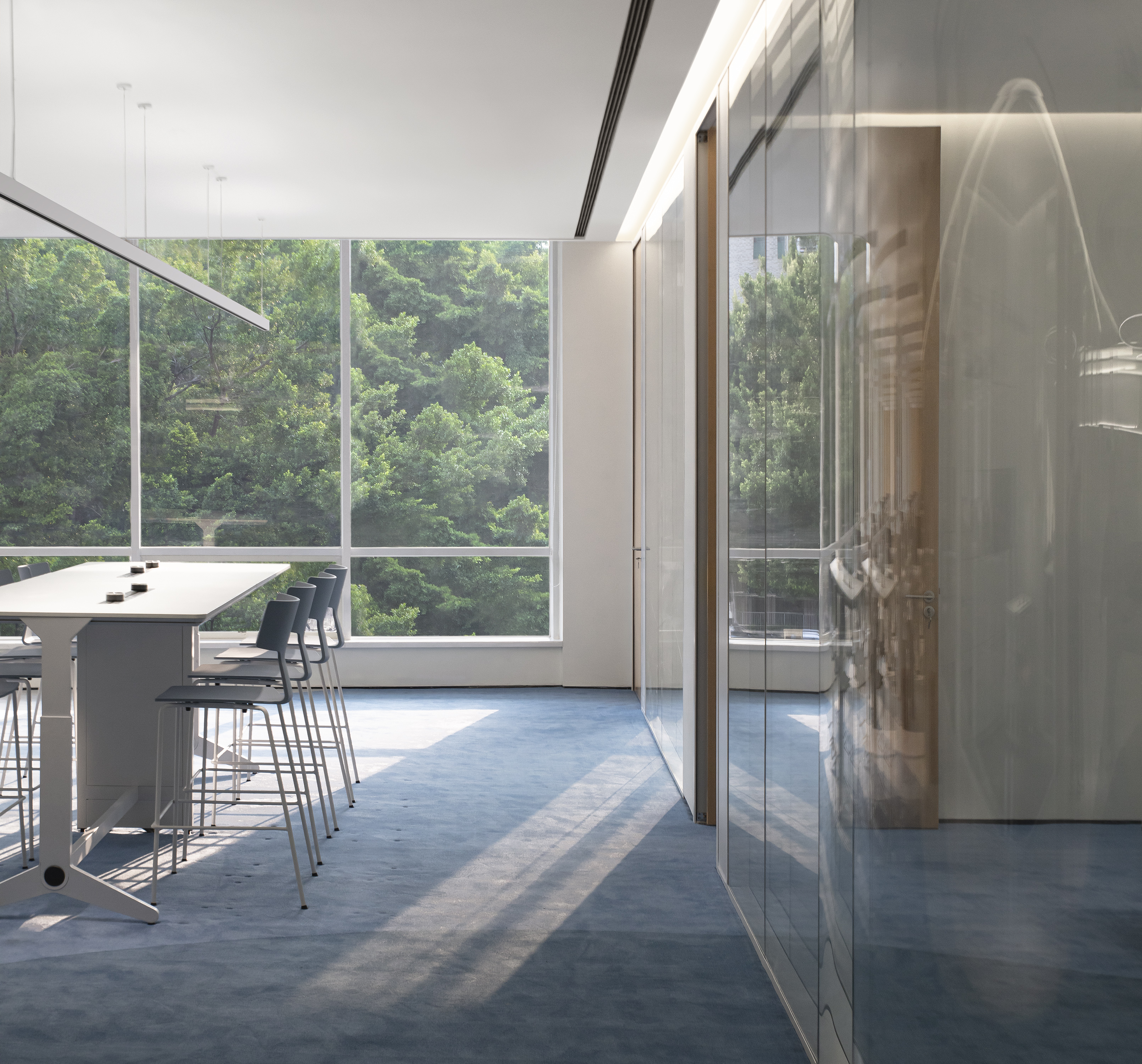
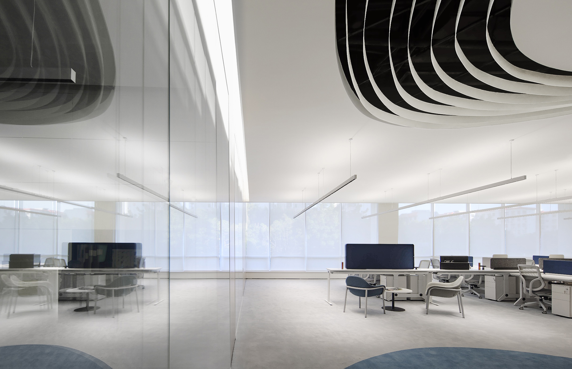
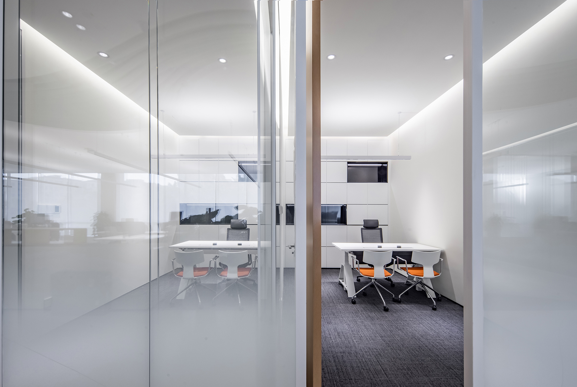
通而不透的空间立面处理上,使用通透的高隔断玻璃作为分割不同功能间与动线之间的界面,无论内外视野都得到了解放,既有利于整体办公环境的自然采光,也有效解决了不同部门之间讨论而产生的噪音问题,在保证不同部门之间的隐私之下,让人们有了更多的交流空间。
To design an open but opaque space facade, transparent high partition glass is used as the boundary between different function areas and moving lines, which expands both inside and outside vision. The design is not only conducive to the natural lighting of the overall office environment, but also an effective solution for the noise caused by discussions between different departments, so that people have more communication space under the guarantee of privacy between different departments.
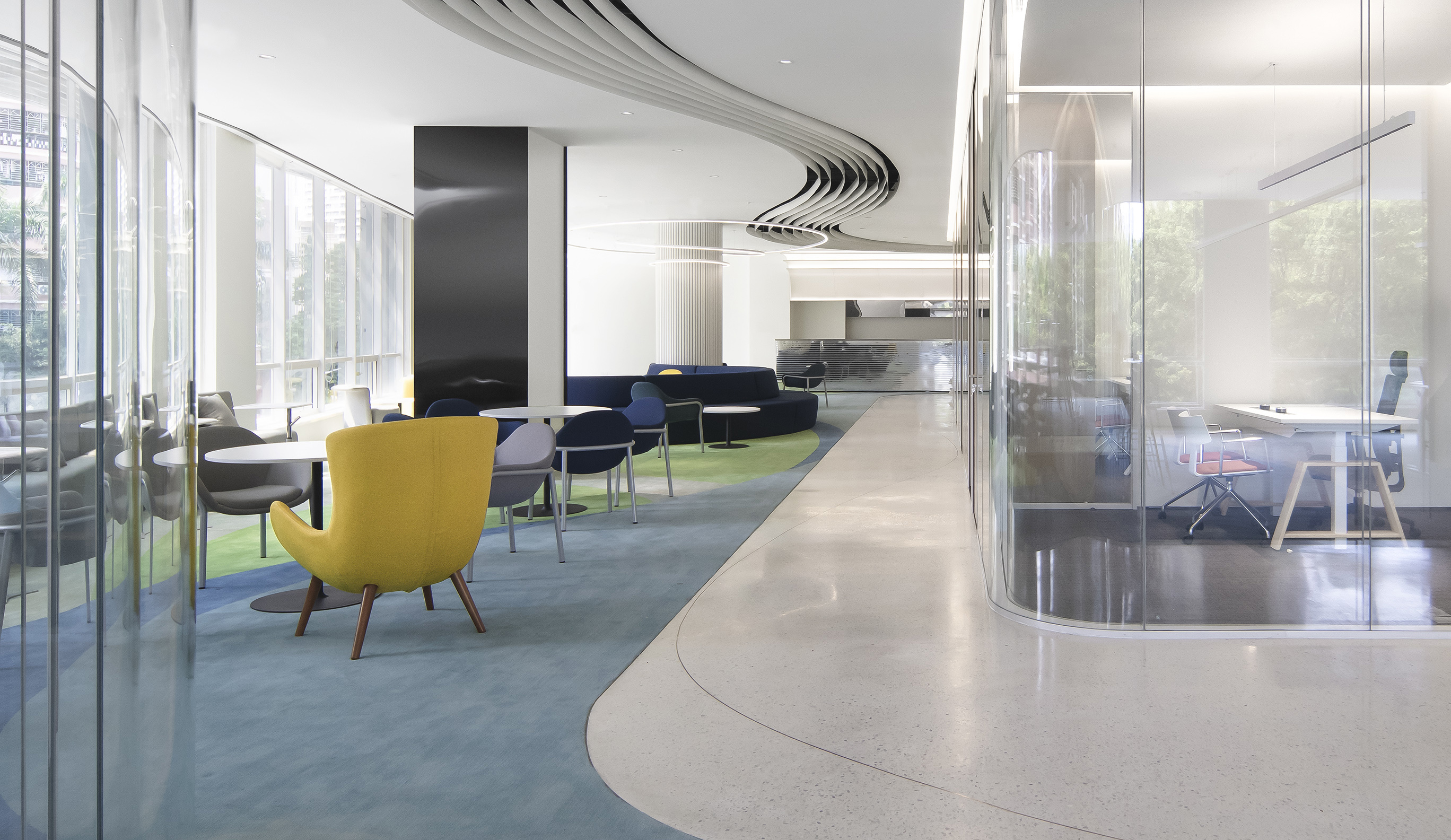
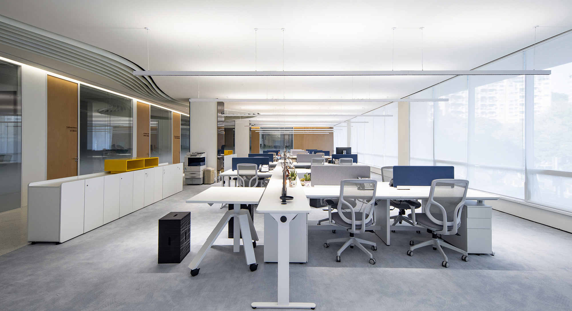
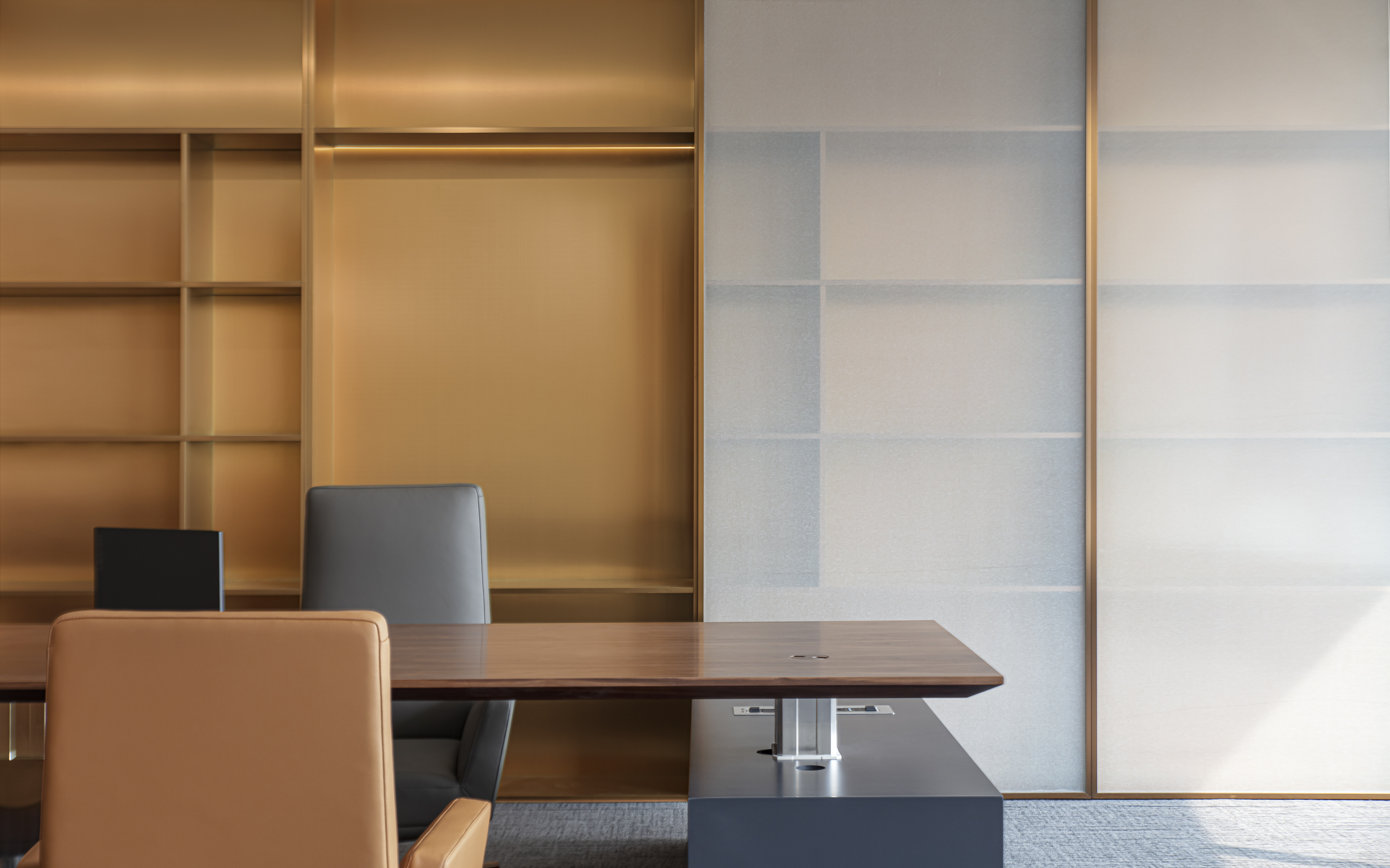
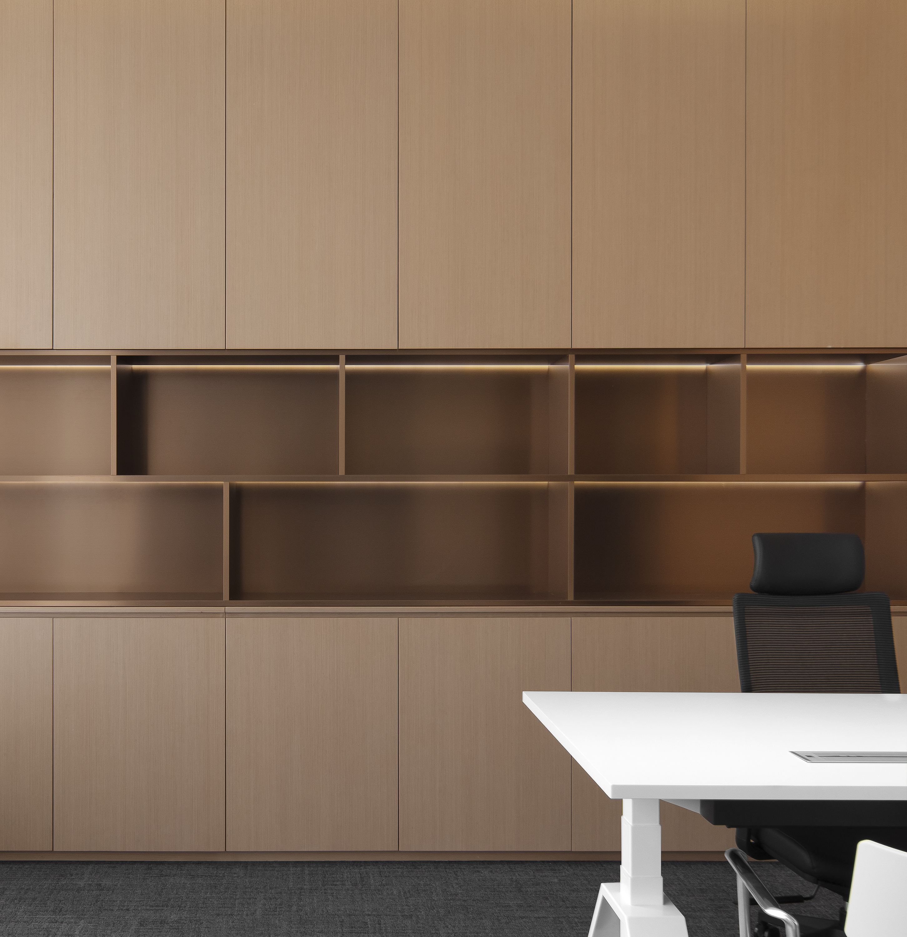
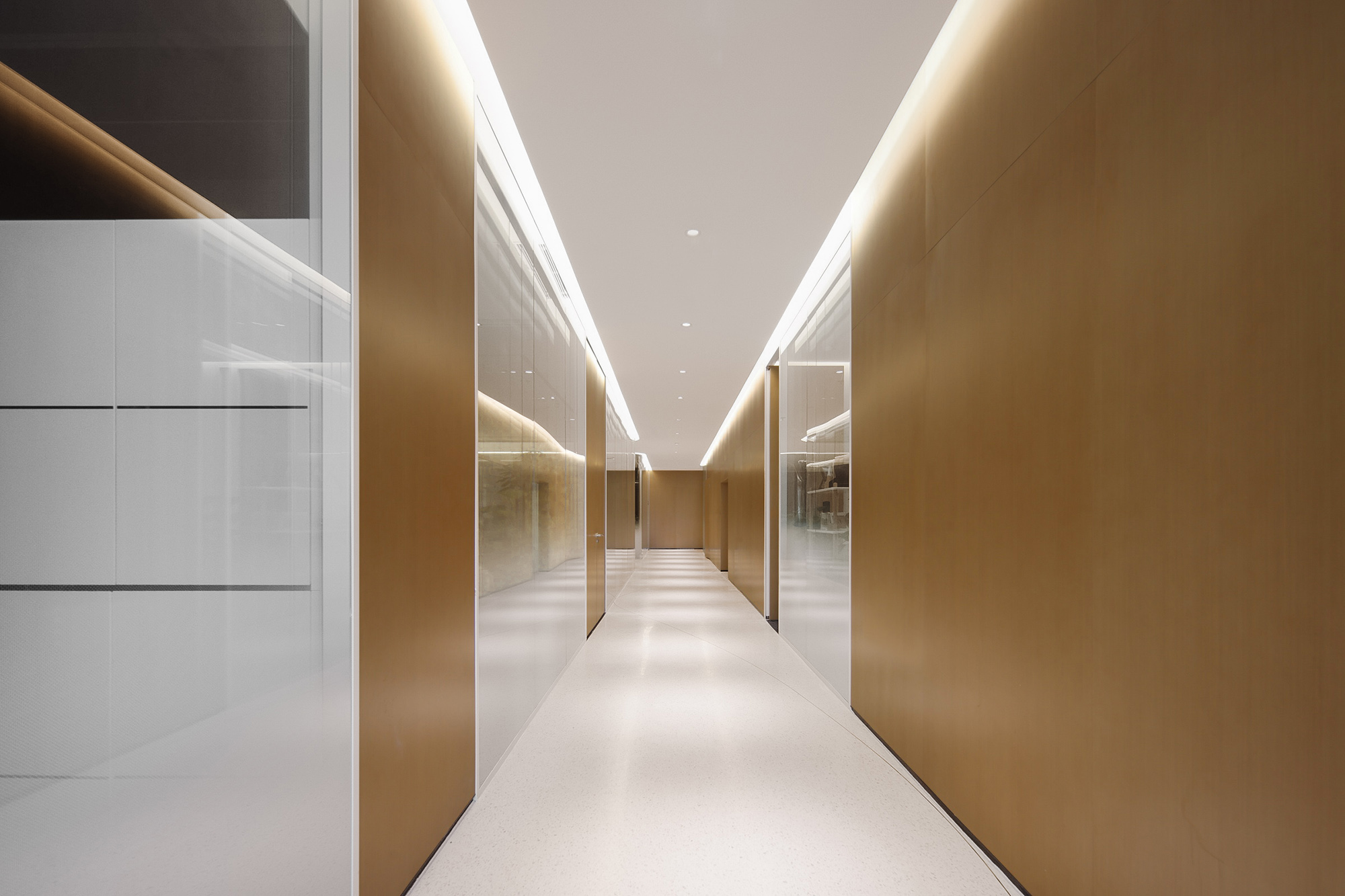
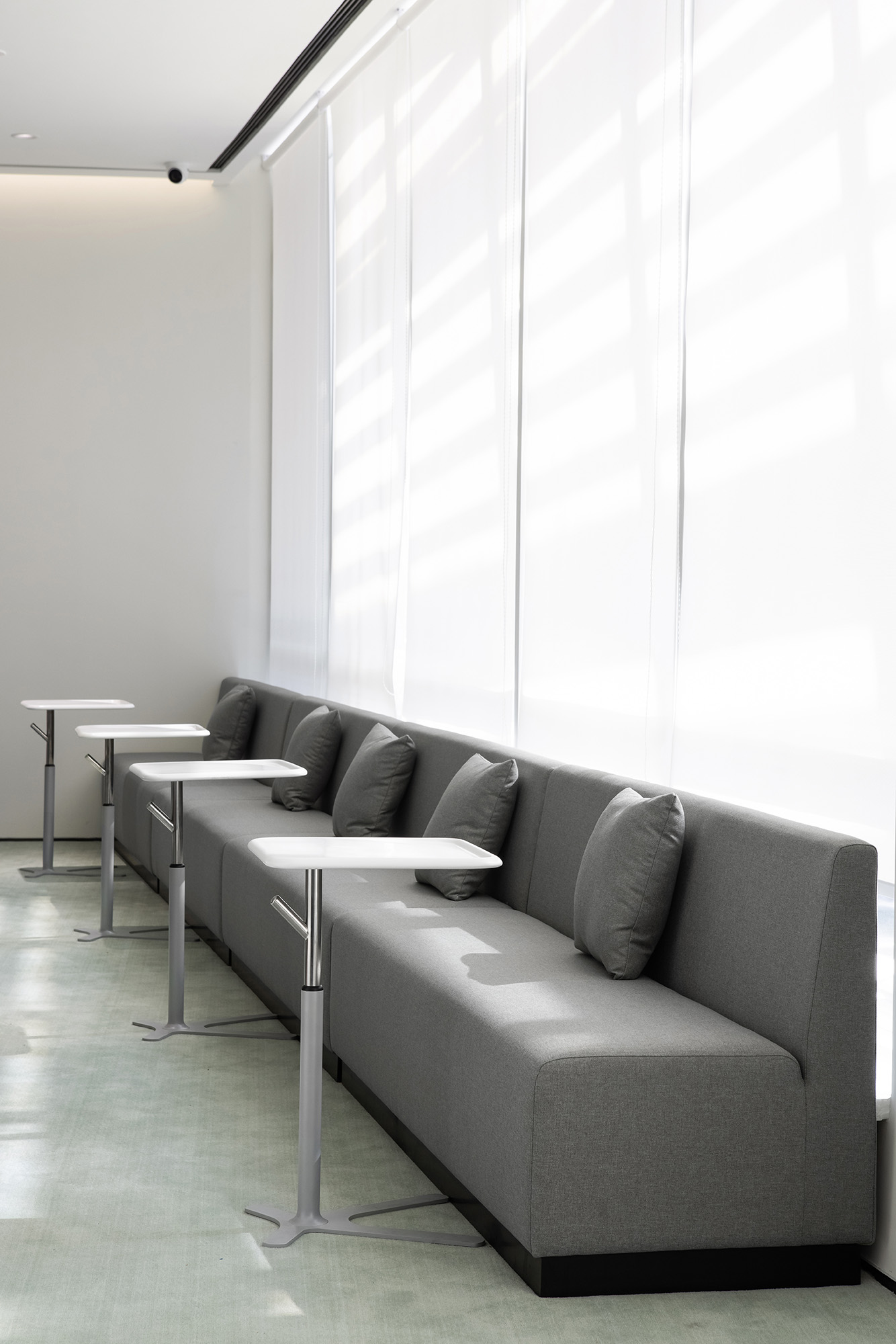
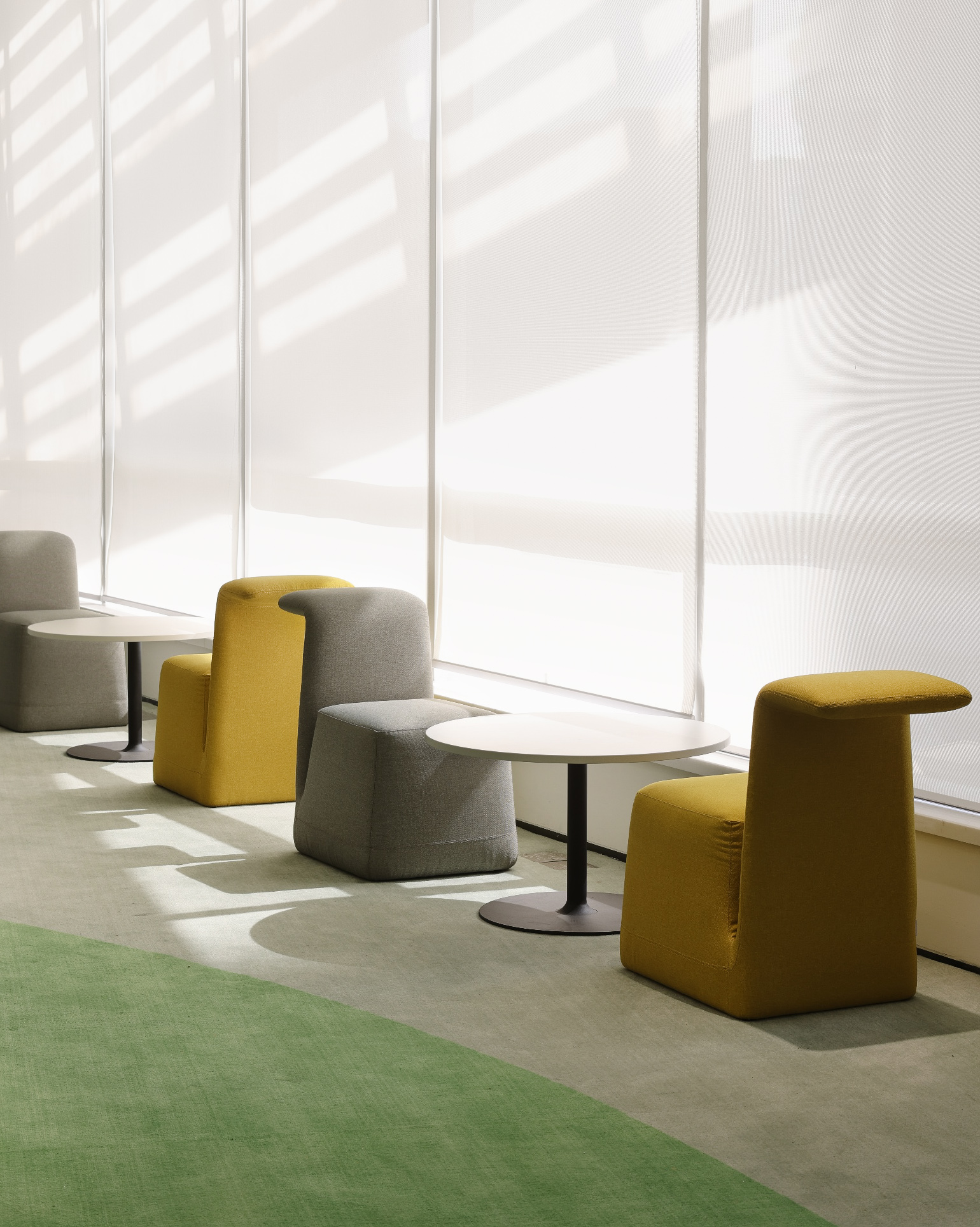
地面的设计与材质也呼应了天花的流线造型,嵌入铜线的水磨石与颜色柔和的块毯分割了办公区与公共走道的界限,它们以飘逸的姿态贯穿了整个场地,也让办公区域与休闲接待区有了柔和而自然的衔接。地毯覆盖的区域就像为人们营造出一个舒适且精致的岛屿。无论是独自工作与思考,抑或和同事进行头脑风暴,还是下午茶闲暇时的漫步,人们都能在这兼具共享与私人空间中感受到这是一间充满活力的办公空间。
The design and material of the ground also echo the streamline shape of the ceiling. The terrazzo with embedded copper wire and the blanket of softened colour separate the office area from the public walkway. They run through the whole site gracefully, and also connect the office area and the leisure reception area gently and naturally. The carpeted area is like a comfortable and exquisite island for people. No matter working or thinking alone, brainstorming with colleagues or walking at the tea time, people can feel it a vibrant office space in the shared and private space.
设计主创 | 朱海博
设计团队 | 方洁、许畅、何梦君
Chief Designer | Hihope Zhu
Design Team | Jane Fang, Xu Chang, He Mengjun

重构百年企业新篇章
--森那美Sime Darby汽车集团总部办公空间
New work | To Rewrite a New Chapter of a Centennial Enterprise
--Space Design of Sime Darby Automotive Group Headquarter Office


项目位处深圳宝安毗邻高速公路与公园、商业街区的交汇处。作为马来西亚历史最悠久的跨国公司森那美集团(Sime Darby),业主更希望改变原有的办公环境于风格,给员工更舒适的办公空间,彻底改造后不仅让办公环境拥有一种亲切独特的感觉,还与日光充足的窗外景观形成平衡和谐的关系。
The project is located in Bao'an, Shenzhen, adjacent to the highways, parks and commercial areas. As the oldest multinational company from Malaysia, Sime Darby, the owner prefers to change the original office environment and style to provide employees with a more comfortable office space. The complete renovation not only gives the office environment a friendly and unique feeling, but also forms a balanced and harmonious relationship with the bright view outside the windows.

百年企业就像一本厚厚的典籍。设计概念以典籍为引线,从前台启始的页面造型开始,就像翻阅森那美这一百年的历史,顺着整条动线,天花似厚厚书页层叠的造型,也似不断涌动的海浪,象征了企业在持续发展中不断构筑美好前景脉络,构成富有动态秩序、便于协作沟通的办公氛围。
A centennial enterprise is like a thick classic. The design concept takes a classic as the lead. Starting from the pages modeling at the reception desk, the journey to look through the 100-year history of Sime Darby has begun. And along the whole moving line, the ceiling with the shape of thick stacked pages also resembles the continuous surging waves, which symbolizes that the enterprise will continuously build a bright future in its sustained development. The design constitutes an office atmosphere full of dynamic order and convenient for collaboration and communication.


由扶梯入口开始,也在这里结束,中间围绕着常用的重要功能区域,像大小会议室、培训室、洽谈室、独立办公区等。人们顺着以动线为主体设计的走廊,可以非常轻松地到达办公室的任何一个区域。这种方式最大程度满足了场地的利用率,减少人们不必要的时间消耗,提升人与人之间的沟通效率。
It starts and ends at the escalator entrance, surrounded by common important function areas, such as large and small meeting rooms, training rooms, negotiation rooms, independent office areas, etc. Along the corridor designed with the moving line as the main body, people can easily reach any area in the office, which maximizes the utilization of the site, reduces unnecessary time-wasting and improves the communication efficiency between each other.


通而不透的空间立面处理上,使用通透的高隔断玻璃作为分割不同功能间与动线之间的界面,无论内外视野都得到了解放,既有利于整体办公环境的自然采光,也有效解决了不同部门之间讨论而产生的噪音问题,在保证不同部门之间的隐私之下,让人们有了更多的交流空间。
To design an open but opaque space facade, transparent high partition glass is used as the boundary between different function areas and moving lines, which expands both inside and outside vision. The design is not only conducive to the natural lighting of the overall office environment, but also an effective solution for the noise caused by discussions between different departments, so that people have more communication space under the guarantee of privacy between different departments.


地面的设计与材质也呼应了天花的流线造型,嵌入铜线的水磨石与颜色柔和的块毯分割了办公区与公共走道的界限,它们以飘逸的姿态贯穿了整个场地,也让办公区域与休闲接待区有了柔和而自然的衔接。地毯覆盖的区域就像为人们营造出一个舒适且精致的岛屿。无论是独自工作与思考,抑或和同事进行头脑风暴,还是下午茶闲暇时的漫步,人们都能在这兼具共享与私人空间中感受到这是一间充满活力的办公空间。
The design and material of the ground also echo the streamline shape of the ceiling. The terrazzo with embedded copper wire and the blanket of softened colour separate the office area from the public walkway. They run through the whole site gracefully, and also connect the office area and the leisure reception area gently and naturally. The carpeted area is like a comfortable and exquisite island for people. No matter working or thinking alone, brainstorming with colleagues or walking at the tea time, people can feel it a vibrant office space in the shared and private space.


设计主创 | 朱海博
设计团队 | 方洁、许畅、何梦君
Chief Designer | Hihope Zhu
Design Team | Jane Fang, Xu Chang, He Mengjun

